Use form data and return a response
Submitted fields arrive in initial. A Return step can turn the workflow result into a message, structured details, a redirect, or a useful next action.
Accessing Form Data in Workflows
Section titled “Accessing Form Data in Workflows”When a form is submitted, the field values are available in the workflow via {{ initial.* }}:
{{ initial.first_name }}{{ initial.email }}{{ initial.group }}The form context object provides submission metadata:
{{ initial.form.formName }}{{ initial.form.submittedAt }}{{ initial.form.triggerId }}For authenticated forms, the user’s identity is also available:
{{ initial.form.authenticatedUser.username }}{{ initial.form.authenticatedUser.connectionName }}{{ initial.form.authenticatedUser.metadata.department }}For sectioned forms, the key of the section the user submitted from is exposed as:
{{ initial.form.section }} // e.g. "contact-info" or "billing"Responding to Submissions
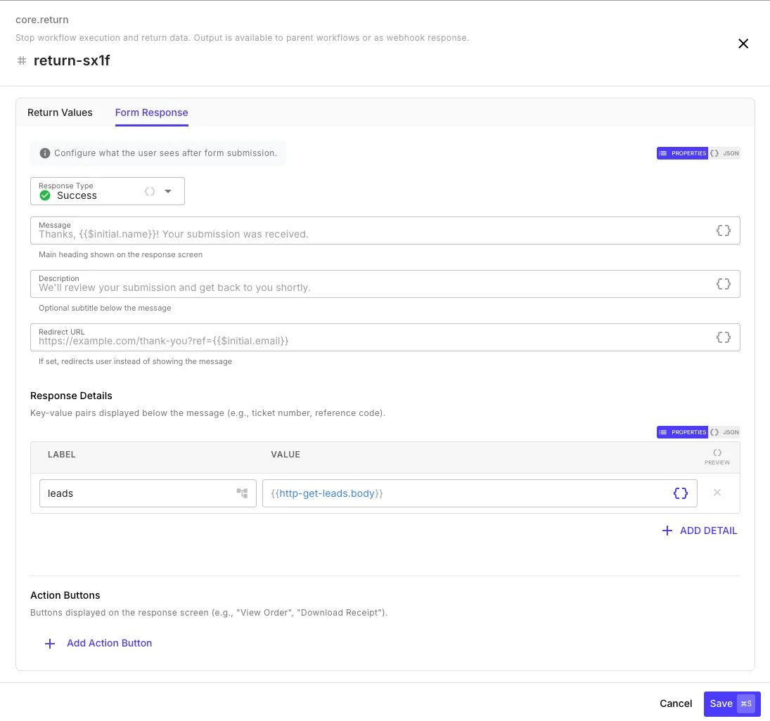
Section titled “Responding to Submissions”By default, users see a generic success message after submitting. To customize the response, add a Return step to your workflow — the step editor shows a Form Response tab when the workflow has a form trigger.
Response Fields
Section titled “Response Fields”| Field | Description | Example |
|---|---|---|
| Response Type | The visual style of the response screen | Success, Error, Warning, Info |
| Message | Main heading shown to the user — supports templates | Thanks, {{ initial.name }}! Your submission was received. |
| Description | Optional subtitle below the heading | We'll review your submission and get back to you shortly. |
| Redirect URL | If set, redirects the user instead of showing a message — supports templates | https://example.com/thank-you?ref={{ initial.email }} |
All text fields support template expressions, so you can personalize the response with the submitted form data or values from earlier workflow steps.
Response Types
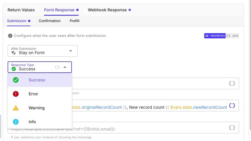
Section titled “Response Types”The Response Type dropdown controls the icon and color theme of the response screen:
| Type | Icon | Use Case |
|---|---|---|
| Success | Green checkmark | Submission processed successfully |
| Error | Red exclamation | Submission failed or was rejected |
| Warning | Yellow triangle | Submission accepted with caveats |
| Info | Blue info | Informational acknowledgment |
Response Details
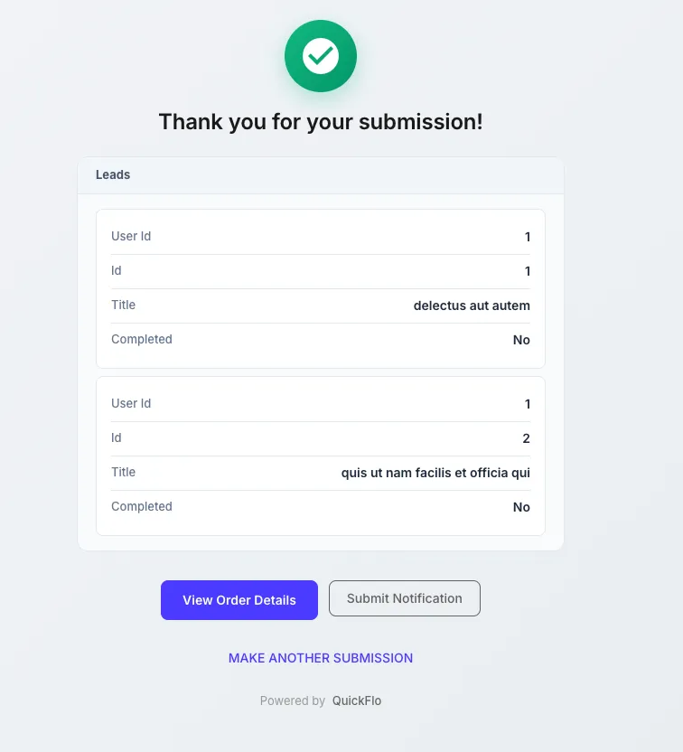
Section titled “Response Details”Add key-value pairs that are displayed below the message as a structured data table. This is useful for showing the user results from the workflow — like a reference number, a summary of what was processed, or data fetched from an API.
| Label | Value |
|---|---|
leads | {{ http-get-leads.body }} |
Reference ID | {{ $util.uuid }} |
Click + Add Detail to add more rows. Objects and arrays are rendered as formatted tables automatically.
Action Buttons
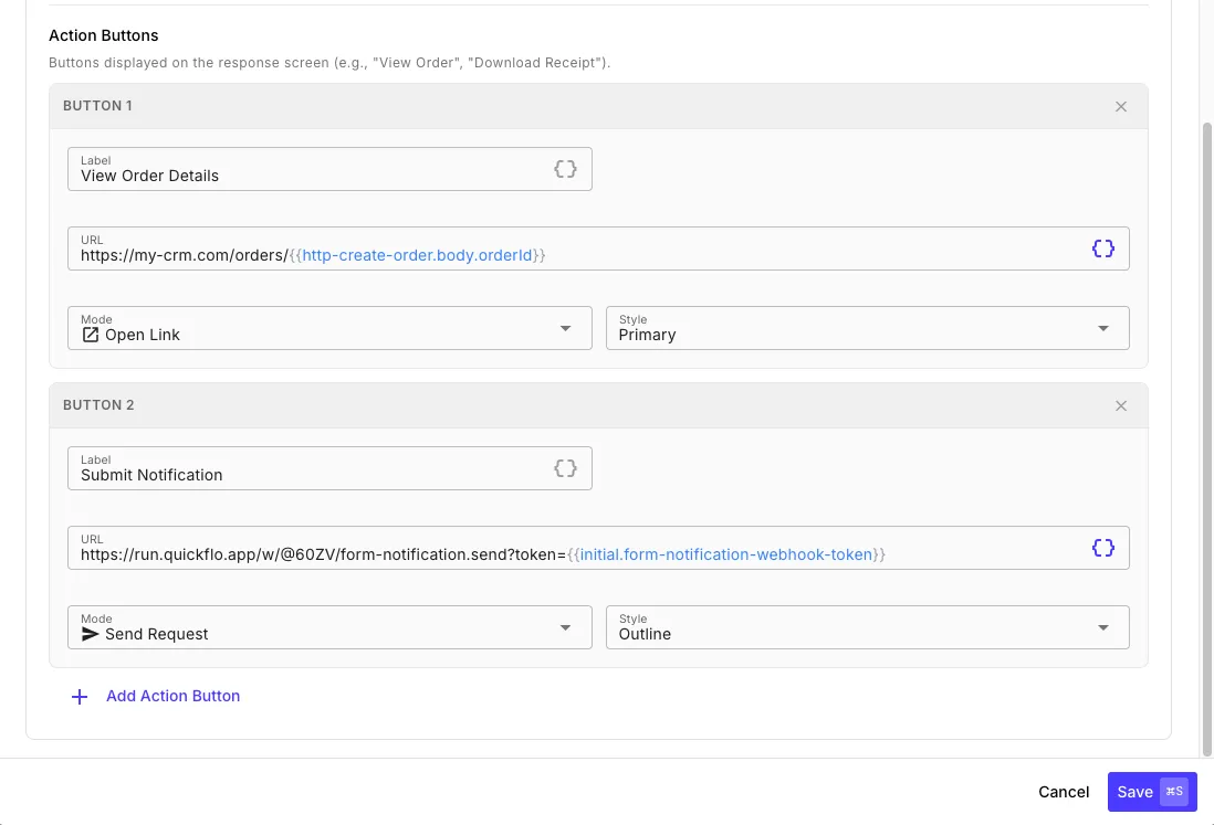
Section titled “Action Buttons”Add buttons to the response screen for follow-up actions. Each button has a label, URL, mode, and style.
| Field | Description |
|---|---|
| Label | Button text — supports templates |
| URL | The target URL — supports templates (e.g., https://my-crm.com/orders/{{ http-create-order.body.orderId }}) |
| Mode | Open Link opens the URL in a new tab. Send Request fires an HTTP request to the URL without navigating away — useful for triggering another webhook or workflow. In Send Request mode the button shows loading and success/error states based on the request outcome, so users get immediate feedback without leaving the response screen. |
| Style | Primary (filled), Secondary (neutral filled), or Outline (bordered) |
Click + Add Action Button to add more. Buttons appear at the bottom of the response screen in the order you define them.
What the User Sees
Section titled “What the User Sees”Successful submission — the response screen shows the message, response details as a formatted table, action buttons, and a “Make Another Submission” link:
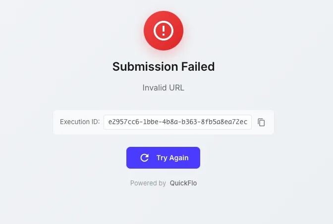
Failed submission — if the workflow errors and “Expose detailed error messages” is enabled in form settings, the user sees the error message along with the execution ID for debugging: