Build dashboards
A dashboard starts with a data source. Widgets query it; dashboard filters coordinate the view.
Data Sources
Section titled “Data Sources”A data source is a thin wrapper around a data store table:
| Field | Description |
|---|---|
| Name | A human-readable label shown in the widget builder |
| Table | The underlying data store table the data source reads from |
| Detected schema | Fields with their types and which ones are aggregatable |
| Time dimension | The date field used for dashboard date-range filtering (set during creation, changeable later) |
| Sync config | Optional — if the data source is populated by a recurring sync workflow, the schedule and last-sync status are surfaced here |
Aggregating Multiple Tables
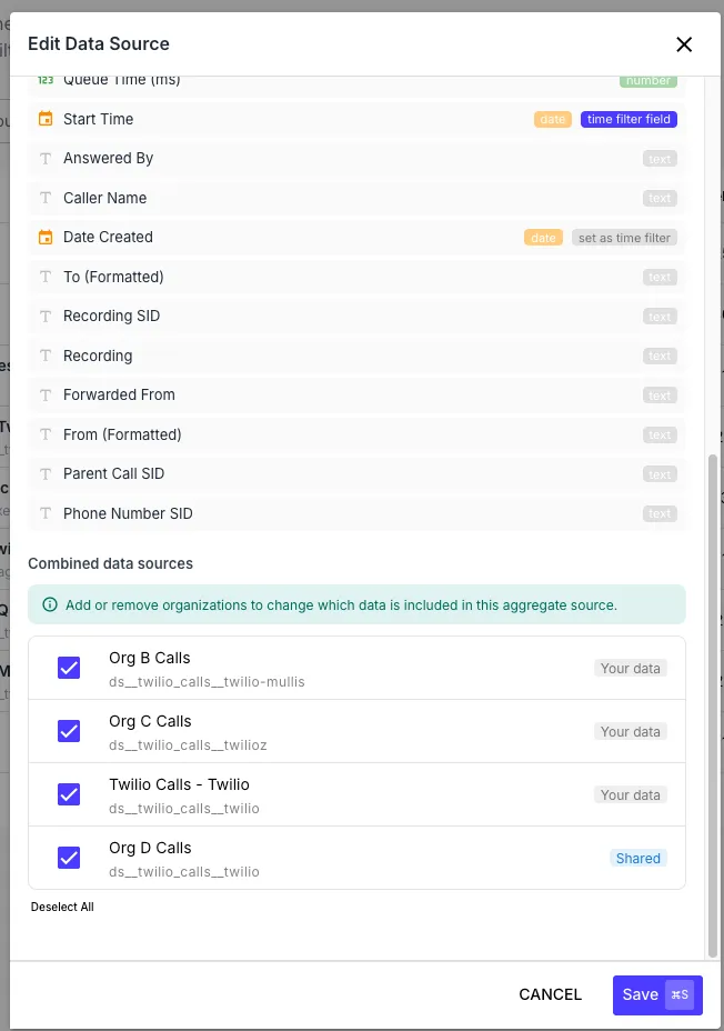
Section titled “Aggregating Multiple Tables”A single data source can aggregate multiple tables across organizations. This is useful when one dashboard needs a combined view, such as call volume across several customer organizations. QuickFlo exposes a virtual _customer dimension for grouping and filtering; each row uses the alias assigned to its source table.
Aggregate sources work for both:
- Cross-org aggregation — your own table plus tables shared from other organizations (see Sharing Tables Across Organizations)
- Same-org multi-table aggregation — your own table combined with other tables in your own org
Shared Data Sources
Section titled “Shared Data Sources”A data source can also point at just a table shared into your organization. It appears in the picker with a Shared badge and remains read-only. If the owner revokes access, new queries stop and affected widgets show a clear error.
Widgets
Section titled “Widgets”Each widget runs an analytics query and renders a chart. Available widget types:
| Widget | Best for |
|---|---|
| Bar | Comparing measures across categories |
| Line / Area | Trends over time |
| Pie / Doughnut | Share-of-total breakdowns (use sparingly — bars are usually clearer) |
| Stat Card | A single headline number (with optional comparison delta) |
| Funnel | Multi-stage conversion flow |
| Data Table | Raw rows or grouped detail with sortable columns |
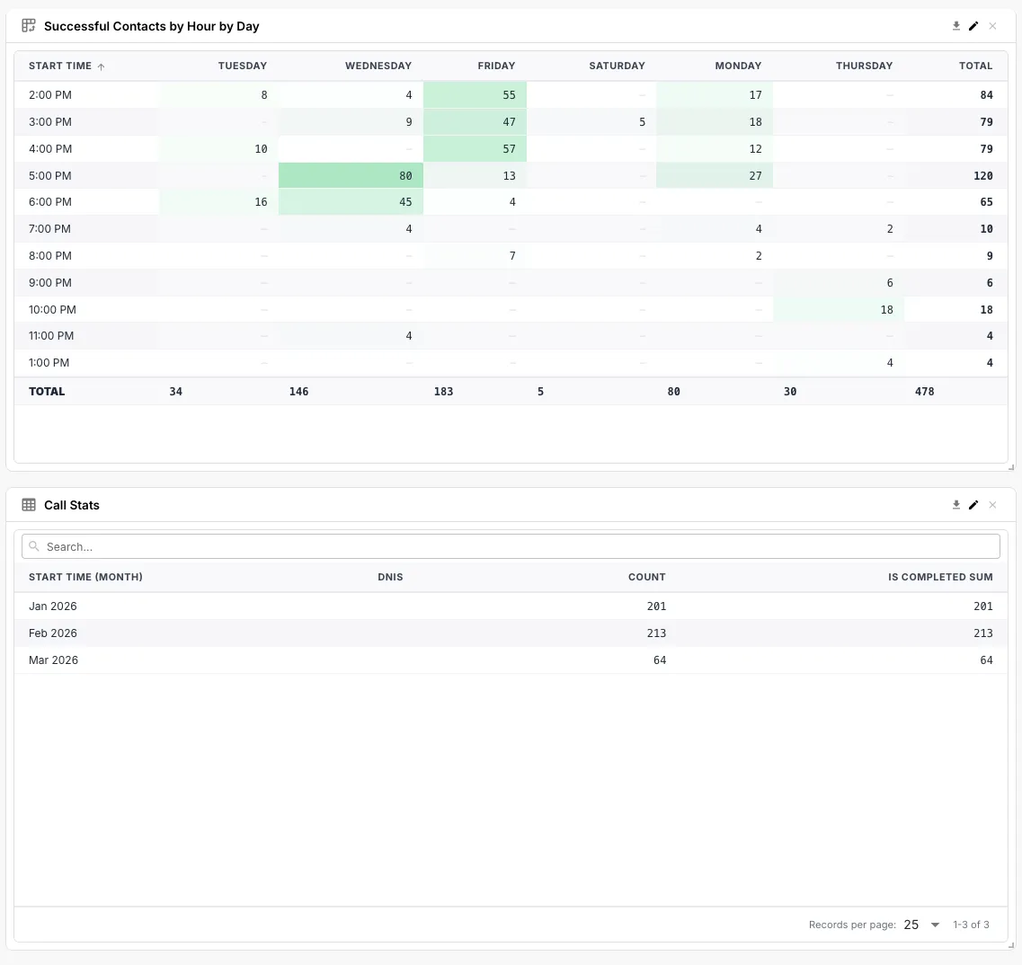
| Stats Table | A grid of measures × categories — like a multi-column stat card |
| Pivot Table | Two-dimensional grid with row/column dimensions, ratio mode, and heatmap shading |
Query Configuration
Section titled “Query Configuration”Every widget has the same query shape under the hood:
- Measures — what to aggregate (e.g.
count,sum(amount),avg(durationSeconds)) - Dimensions — what to group by (e.g.
region,direction,agentName) - Time dimensions — a date field plus a granularity (15min, 30min, hour, day, week, month, year)
- Filters — narrow the dataset before aggregation
- Joins — optionally join in another data source by a key field
- Order — sort the result set by a measure or dimension
- Limit — cap the number of rows returned
- Time range — the date window the query covers (relative
last 7 days, or an absolute start/end)
Pivot Tables
Section titled “Pivot Tables”The pivot table widget supports:
- Row and column dimensions — including inline date bucketing via field suffixes (
createdAt:hourOfDay,createdAt:dayOfWeek,createdAt:month, etc.) so you can pivot “calls by agent × hour of day” without precomputing the bucket - Ratio mode — switch the cell display from raw measure values to ratios (with percent formatting) for “what fraction of the total” views
- Heatmap shading — color-scale cells from low to high so outliers pop visually
Filters
Section titled “Filters”Dashboards have two layers of filtering:
Dashboard-Level Filters (Auto-Wire)
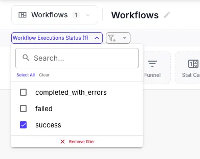
Section titled “Dashboard-Level Filters (Auto-Wire)”Click + Filter in the dashboard toolbar to add a global filter that drives the whole dashboard — a region dropdown, a customer selector, an environment switcher. Each filter has:
- A label shown in the toolbar
- Bindings — one or more
(data source, dimension)pairs that this filter targets
The bindings array is the magic: a single filter can wire itself to multiple data sources at once by mapping the same logical concept (region) to whichever field name each data source uses for it. Add a “Region” filter, bind it to region on data source A and geography.region_code on data source B, and selecting “EMEA” updates every widget connected to either source. No widget changes needed.
You can save default filter selections so a dashboard always loads with a sensible starting state.
Widget-Level Filters
Section titled “Widget-Level Filters”Each widget can also have its own filters, applied on top of the dashboard’s. These come in two flavours:
- Simple mode — structured rows with field, operator, and value (
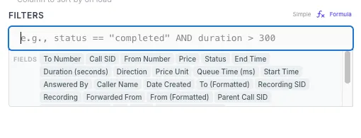
status equals active,amount greater than 100). Operators areequals,notEquals,contains,notContains,gt(>),gte(>=),lt(<),lte(<=),set(is set), andnotSet(is not set). TheequalsandnotEqualsoperators support multi-value chip selection with searchable options pulled from the underlying data, so you can pick a list of accepted values without typing them by hand. - Formula mode — a code editor for expressions that combine
AND,OR,NOT, comparisons, arithmetic, and supported functions. Use brackets for field names with spaces, such as[Retry Count]. Member access is reserved for data-store references such as$ds.table.key. Use formula mode when simple rows do not express the rule — for example(status == 'active' OR retryCount > 3) AND createdAt > '2024-01-01'.