Form Triggers
Form triggers let you create hosted forms that trigger a workflow when submitted. QuickFlo includes a full drag-and-drop form builder with live preview, field validation, branding options, and optional password protection — no external form tools needed.
Each form gets a unique public URL that you can share with anyone. When someone submits the form, QuickFlo starts the workflow with the submitted values as input data.
Adding a Form Trigger
Section titled “Adding a Form Trigger”There are two ways to add a form trigger:
From the Triggers Page
Section titled “From the Triggers Page”-
Navigate to the Triggers page and click New Trigger
-
Select Form as the trigger type
-
Choose an existing workflow or click + to create a new one
-
Optionally name the trigger and import a form definition JSON file
-
Click Create Trigger — you’ll be taken directly to the form builder
From the Workflow Builder
Section titled “From the Workflow Builder”-
Open a workflow in the builder
-
In the Library sidebar under Triggers, click Form
-
A form trigger node appears on the canvas — click it to configure
Once added, you should provide a unique form name. QuickFlo will generate a unique URL for the form using the name you provide. Click the trigger node to see the URL, edit the form, or open it in a new tab.
| Field | Description |
|---|---|
| Name | Human-readable identifier for the trigger (optional) |
| Form URL | The public URL where the form is hosted — share this with users |
| Title | The form title shown at the top of the page |
| Fields | Summary of configured fields |
Click Edit Form to open the form builder.
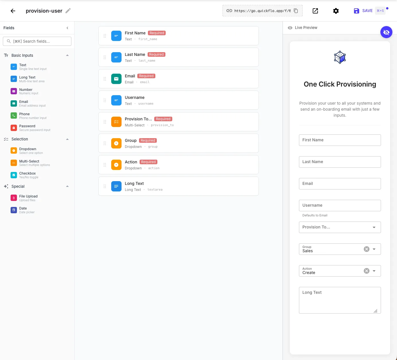
The Form Builder
Section titled “The Form Builder”The form builder is a visual drag-and-drop editor with three panels:
Fields palette (left) — drag field types onto the form:
| Category | Field Types |
|---|---|
| Basic Inputs | Text, Long Text, Number, Email, Phone, Password |
| Selection | Dropdown, Multi-Select, Checkbox |
| Special | File Upload, Date |
Form layout (center) — arrange fields, set labels, mark fields as required, and configure field IDs. The field ID is the key used to access the value in your workflow (e.g., a field with ID first_name is accessed as {{ initial.first_name }}).
Live preview (right) — see exactly what the form looks like to end users as you build it. The preview updates in real-time as you add and configure fields.
Configuring Fields
Section titled “Configuring Fields”Click any field in the form layout to configure it:
- Label — the display name shown to users
- Field ID — the key used in template expressions (auto-generated from the label, or set manually)
- Required — whether the field must be filled before submission
- Placeholder — hint text shown inside the input
- Default value — pre-filled value (optional)
For Dropdown and Multi-Select fields, you also define the list of options.
Import & Export
Section titled “Import & Export”The form builder’s Options menu (vertical dots icon in the header) lets you export and import form definitions as JSON files:
- Export Definition — Downloads a
.jsonfile containing the form’s schema, metadata, and auth configuration. Use this to back up a form, share it with a teammate, or duplicate it across workflows. - Import Definition — Upload a previously exported
.jsonfile to replace the current form’s fields and settings. You can also import a form definition during trigger creation from the Triggers page.
Form Settings
Section titled “Form Settings”Click the settings gear icon in the form builder toolbar to open Form Settings.
Branding
Section titled “Branding”Customize the look of your hosted form page:
| Field | Description |
|---|---|
| Logo URL | URL of an image displayed at the top of the form |
| Page Title | Custom browser tab title (defaults to the form title) |
| Favicon URL | Custom favicon for the hosted form page |
| Layout | Container width preset — narrow, standard, wide, or full. Use narrow for short auth forms, wide or full for forms with many sections or wide tables. |
Success and Error Messages
Section titled “Success and Error Messages”- Success message — shown to users after a successful submission (or use a Return step to control the response dynamically)
- Error message — custom message shown when submission fails
Data Import
Section titled “Data Import”Enable bulk upload mode to let users upload a CSV file to submit multiple entries at once. Each row in the CSV becomes a separate workflow execution.
Error Handling
Section titled “Error Handling”Toggle Expose detailed error messages to control whether users see the actual error message from the workflow or a generic error. Keep this off in production to avoid leaking internal details.
Password Protecting Forms
Section titled “Password Protecting Forms”By default, forms are public — anyone with the URL can submit them. To restrict access, you can require users to sign in with credentials before seeing the form.
Step 1: Create a Form Auth Connection
Section titled “Step 1: Create a Form Auth Connection”Form users are managed as Form Auth connections. Each connection represents a username/password credential.
-
Navigate to Connections in the QuickFlo sidebar
-
Click New Connection and select Form Auth
-
Fill in the credentials:
Field Description Username The user’s identifier (email, username, etc.) Password Password for form access Metadata Optional key-value pairs passed to the workflow on submission (e.g., department, role, permissions) -
Click Save
You can create as many Form Auth connections as you need — each represents a different user who can access the form.
Step 2: Enable Authentication on the Form
Section titled “Step 2: Enable Authentication on the Form”-
Open the form builder and click the settings gear icon
-
Under Access Control, change Authentication to Require credentials
-
In Authorized Users, select the Form Auth connections that should have access
-
Optionally add a Login Hint — a message displayed on the sign-in screen (e.g., “Use your company email and the password provided by your admin”)
-
Close settings and save the workflow
Now when someone visits the form URL, they’ll see a login screen before the form loads. Only users with matching Form Auth credentials can access it.
Form Sections (Tabs)
Section titled “Form Sections (Tabs)”For longer forms, group fields into sections that render as a tabbed interface. Each section is a labelled tab the user can flip between, with its own subset of fields.
Open the form trigger config and add sections to the form config. Each section defines the keys of the fields it contains (the fields must already exist in the form):
{ "sections": [ { "key": "contact-info", "label": "Contact Info", "icon": "user", "description": "How can we reach you?", "fields": ["first_name", "last_name", "email", "phone"] }, { "key": "company", "label": "Company", "icon": "building", "fields": ["company_name", "company_size", "industry"] }, { "key": "details", "label": "Use Case", "fields": ["use_case", "timeline"] } ]}| Field | Description |
|---|---|
key | Stable identifier — exposed to the workflow as {{ initial.form.section }} |
label | Tab label shown to the user |
icon | Optional icon name displayed next to the tab label |
description | Optional helper text shown above the section’s fields |
fields | Array of field names from the form to include in this section. Fields not assigned to any section render outside the tabs. |
Inside the workflow, the section the user submitted from is available at {{ initial.form.section }}, which is useful for routing or analytics.
Prefill Workflows
Section titled “Prefill Workflows”A prefill workflow runs before the form renders and returns initial values for the form fields. Use it to look up a customer record by query string and pre-populate name/email/phone, prefill default values pulled from your CRM, or seed a form from a token in the URL.
Configure it on the form trigger by pointing prefill.workflowId at another workflow:
{ "prefill": { "workflowId": "wf_lookup_customer", "timeoutMs": 10000 }}| Field | Description |
|---|---|
workflowId | The workflow to run before rendering the form. Receives the page query string as initial, plus any prefill context the form provides. |
timeoutMs | Hard timeout for the prefill workflow (1,000–30,000 ms, default 10,000). |
The prefill workflow’s Return step writes a formPrefill object whose fields map carries partial JSON Schema overrides per field. The most common override is default (which pre-populates a value), but you can also restrict dropdown options via enum, hide fields via visible: false, or mark them read-only:
{ "formPrefill": { "fields": { "first_name": { "default": "Jane" }, "email": { "default": "jane@acme.com", "readonly": true }, "region": { "enum": ["US", "CA"], "default": "US" }, "internal_notes": { "visible": false } } }}See Return Step — Form Prefill Response for the full list of supported overrides.
Confirmation Workflows
Section titled “Confirmation Workflows”A confirmation workflow runs after the user clicks Submit but before the main workflow runs. It returns a summary that QuickFlo shows to the user in a confirmation dialog — the user has to explicitly approve before the main workflow executes. Use it for showing a quote, calculated total, or any “review and confirm” UX.
{ "confirmation": { "workflowId": "wf_calculate_quote", "timeoutMs": 10000 }}| Field | Description |
|---|---|
workflowId | The workflow to run before final submission. Receives the form values as initial. |
timeoutMs | Hard timeout for the confirmation workflow (1,000–30,000 ms, default 10,000). |
The confirmation workflow’s Return step should return a formConfirmation summary object:
{ "formConfirmation": { "title": "Confirm your order", "summary": "You're about to submit this for review.", "items": [ { "label": "Plan", "value": "Pro" }, { "label": "Total", "value": "$99/mo" } ], "warningMessage": "Cancellation is subject to our refund policy." }}QuickFlo shows the title, summary, items, and any warning to the user before they confirm. If the user cancels at the confirmation step, the main workflow never runs.
Accessing Form Data in Workflows
Section titled “Accessing Form Data in Workflows”When a form is submitted, the field values are available in the workflow via {{ initial.* }}:
{{ initial.first_name }}{{ initial.email }}{{ initial.group }}The form context object provides submission metadata:
{{ initial.form.formName }}{{ initial.form.submittedAt }}{{ initial.form.triggerId }}For authenticated forms, the user’s identity is also available:
{{ initial.form.authenticatedUser.username }}{{ initial.form.authenticatedUser.connectionName }}{{ initial.form.authenticatedUser.metadata.department }}For sectioned forms, the key of the section the user submitted from is exposed as:
{{ initial.form.section }} // e.g. "contact-info" or "billing"Responding to Submissions
Section titled “Responding to Submissions”By default, users see a generic success message after submitting. To customize the response, add a Return step to your workflow — the step editor shows a Form Response tab when the workflow has a form trigger.
Response Fields
Section titled “Response Fields”| Field | Description | Example |
|---|---|---|
| Response Type | The visual style of the response screen | Success, Error, Warning, Info |
| Message | Main heading shown to the user — supports templates | Thanks, {{ initial.name }}! Your submission was received. |
| Description | Optional subtitle below the heading | We'll review your submission and get back to you shortly. |
| Redirect URL | If set, redirects the user instead of showing a message — supports templates | https://example.com/thank-you?ref={{ initial.email }} |
All text fields support template expressions, so you can personalize the response with the submitted form data or values from earlier workflow steps.
Response Types
Section titled “Response Types”The Response Type dropdown controls the icon and color theme of the response screen:
| Type | Icon | Use Case |
|---|---|---|
| Success | Green checkmark | Submission processed successfully |
| Error | Red exclamation | Submission failed or was rejected |
| Warning | Yellow triangle | Submission accepted with caveats |
| Info | Blue info | Informational acknowledgment |
Response Details
Section titled “Response Details”Add key-value pairs that are displayed below the message as a structured data table. This is useful for showing the user results from the workflow — like a reference number, a summary of what was processed, or data fetched from an API.
| Label | Value |
|---|---|
leads | {{ http-get-leads.body }} |
Reference ID | {{ $util.uuid }} |
Click + Add Detail to add more rows. Objects and arrays are rendered as formatted tables automatically.
Action Buttons
Section titled “Action Buttons”Add buttons to the response screen for follow-up actions. Each button has a label, URL, mode, and style.
| Field | Description |
|---|---|
| Label | Button text — supports templates |
| URL | The target URL — supports templates (e.g., https://my-crm.com/orders/{{ http-create-order.body.orderId }}) |
| Mode | Open Link opens the URL in a new tab. Send Request fires an HTTP request to the URL without navigating away — useful for triggering another webhook or workflow. In Send Request mode the button shows loading and success/error states based on the request outcome, so users get immediate feedback without leaving the response screen. |
| Style | Primary (filled), Secondary (neutral filled), or Outline (bordered) |
Click + Add Action Button to add more. Buttons appear at the bottom of the response screen in the order you define them.
What the User Sees
Section titled “What the User Sees”Successful submission — the response screen shows the message, response details as a formatted table, action buttons, and a “Make Another Submission” link:
Failed submission — if the workflow errors and “Expose detailed error messages” is enabled in form settings, the user sees the error message along with the execution ID for debugging: