
Build and secure a form
A form trigger gives a workflow a hosted entry point. Build the fields, set the page behavior, and decide whether the link is public or restricted.
Adding a Form Trigger
Section titled “Adding a Form Trigger”There are two ways to add a form trigger:
From the Triggers Page
Section titled “From the Triggers Page”-
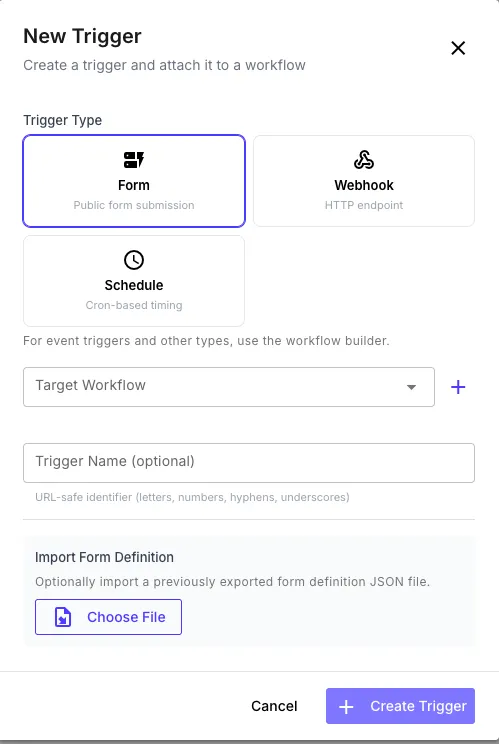
Navigate to the Triggers page and click New Trigger
-
Select Form as the trigger type
-
Choose an existing workflow or click + to create a new one
-
Optionally name the trigger and import a form definition JSON file
-
Click Create Trigger — you’ll be taken directly to the form builder
From the Workflow Builder
Section titled “From the Workflow Builder”-
Open a workflow in the builder
-
In the Library sidebar under Triggers, click Form
-
A form trigger node appears on the canvas — click it to configure
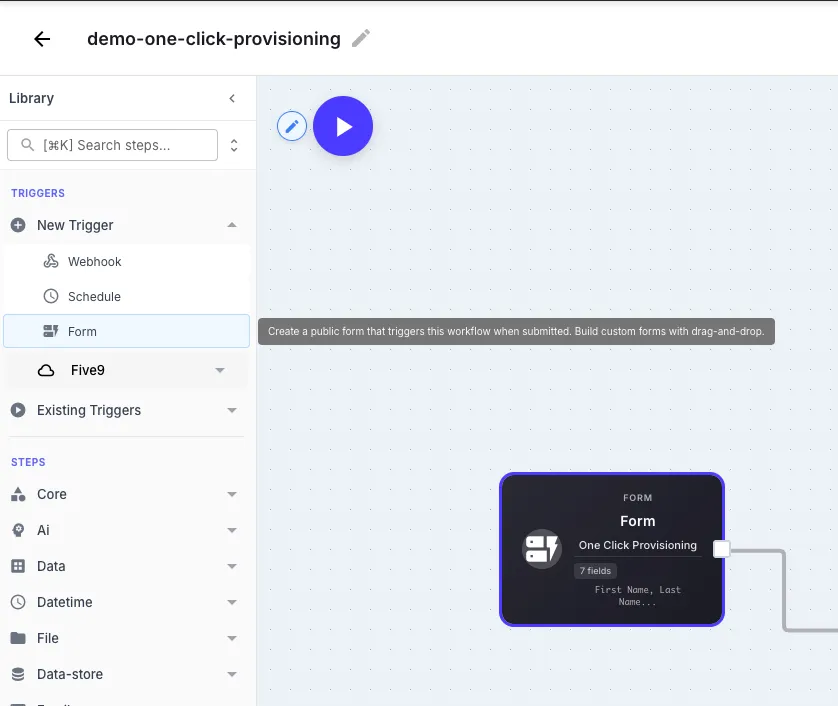
Once added, you should provide a unique form name. QuickFlo will generate a unique URL for the form using the name you provide. Click the trigger node to see the URL, edit the form, or open it in a new tab.
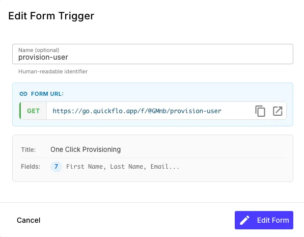
| Field | Description |
|---|---|
| Name | Human-readable identifier for the trigger (optional) |
| Form URL | The public URL where the form is hosted — share this with users |
| Title | The form title shown at the top of the page |
| Fields | Summary of configured fields |
Click Edit Form to open the form builder.
The Form Builder
Section titled “The Form Builder”The form builder is a visual drag-and-drop editor with three panels:
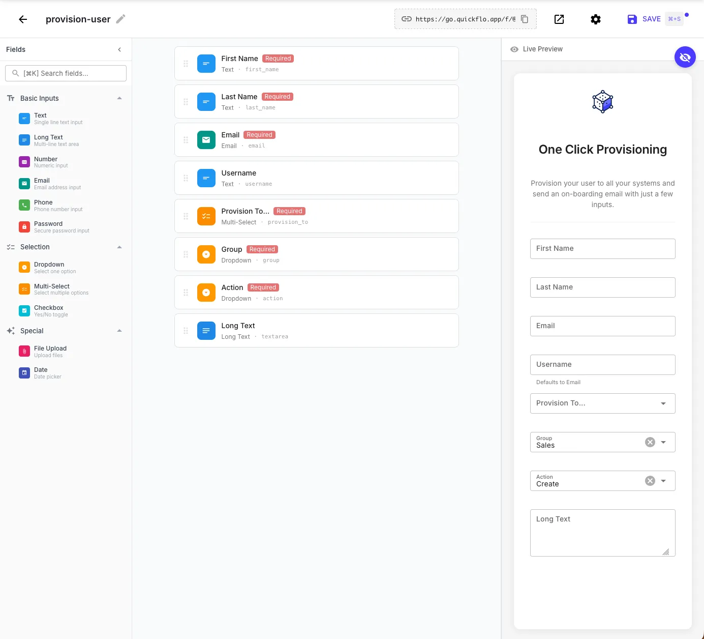
Fields palette (left) — drag field types onto the form:
| Category | Field Types |
|---|---|
| Basic Inputs | Text, Long Text, Number, Email, Phone, Password |
| Selection | Dropdown, Multi-Select, Checkbox |
| Special | File Upload, Date |
Form layout (center) — arrange fields, set labels, mark fields as required, and configure field IDs. The field ID is the key used to access the value in your workflow (e.g., a field with ID first_name is accessed as {{ initial.first_name }}).
Live preview (right) — see exactly what the form looks like to end users as you build it. The preview updates in real-time as you add and configure fields.
Configuring Fields
Section titled “Configuring Fields”Click any field in the form layout to configure it:
- Label — the display name shown to users
- Field ID — the key used in template expressions (auto-generated from the label, or set manually)
- Required — whether the field must be filled before submission
- Placeholder — hint text shown inside the input
- Default value — pre-filled value (optional)
For Dropdown and Multi-Select fields, you also define the list of options.
Import & Export
Section titled “Import & Export”The form builder’s Options menu (vertical dots icon in the header) lets you export and import form definitions as JSON files:
- Export Definition — Downloads a
.jsonfile containing the form’s schema, metadata, and auth configuration. Use this to back up a form, share it with a teammate, or duplicate it across workflows. - Import Definition — Upload a previously exported
.jsonfile to replace the current form’s fields and settings. You can also import a form definition during trigger creation from the Triggers page.
Form Settings
Section titled “Form Settings”Click the settings gear icon in the form builder toolbar to open Form Settings.
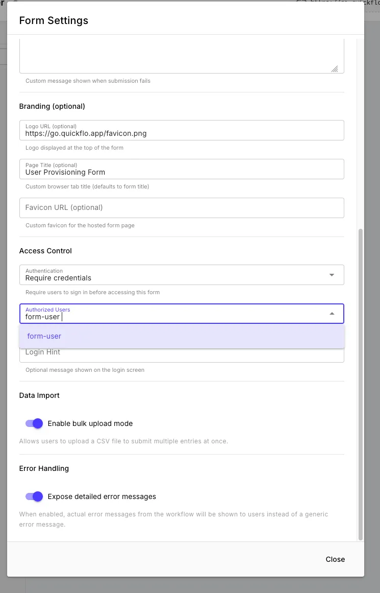
Branding
Section titled “Branding”Customize the look of your hosted form page:
| Field | Description |
|---|---|
| Logo URL | URL of an image displayed at the top of the form |
| Page Title | Custom browser tab title (defaults to the form title) |
| Favicon URL | Custom favicon for the hosted form page |
| Layout | Container width preset — narrow, standard, wide, or full. Use narrow for short auth forms, wide or full for forms with many sections or wide tables. |
Success and Error Messages
Section titled “Success and Error Messages”- Success message — shown to users after a successful submission (or use a Return step to control the response dynamically)
- Error message — custom message shown when submission fails
Data Import
Section titled “Data Import”Enable bulk upload mode to let users upload a CSV file to submit multiple entries at once. Each row in the CSV becomes a separate workflow execution.
Error Handling
Section titled “Error Handling”Toggle Expose detailed error messages to control whether users see the actual error message from the workflow or a generic error. Keep this off in production to avoid leaking internal details.
Password Protecting Forms
Section titled “Password Protecting Forms”By default, forms are public — anyone with the URL can submit them. To restrict access, you can require users to sign in with credentials before seeing the form.
Step 1: Create a Form Auth Connection
Section titled “Step 1: Create a Form Auth Connection”People who can sign in are represented by Form Auth connections. Each connection stores one username/password credential.
-
Navigate to Connections in the QuickFlo sidebar
-
Click New Connection and select Form Auth
-
Fill in the credentials:
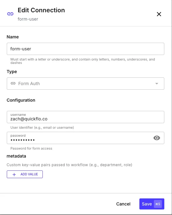
Field Description Username The user’s identifier (email, username, etc.) Password Password for form access Metadata Optional key-value pairs passed to the workflow on submission (e.g., department, role, permissions) -
Click Save
Create one Form Auth connection for each person who should be able to access the form.
Step 2: Enable Authentication on the Form
Section titled “Step 2: Enable Authentication on the Form”-
Open the form builder and click the settings gear icon
-
Under Access Control, change Authentication to Require credentials
-
In Authorized Users, select the Form Auth connections that should have access
-
Optionally add a Login Hint — a message displayed on the sign-in screen (e.g., “Use your company email and the password provided by your admin”)
-
Close settings and save the workflow
Now when someone visits the form URL, they’ll see a login screen before the form loads. Only users with matching Form Auth credentials can access it.
Form Sections (Tabs)
Section titled “Form Sections (Tabs)”For longer forms, group fields into sections that render as a tabbed interface. Each section is a labelled tab the user can flip between, with its own subset of fields.
Open the form trigger config and add sections to the form config. Each section defines the keys of the fields it contains (the fields must already exist in the form):
{ "sections": [ { "key": "contact-info", "label": "Contact Info", "icon": "user", "description": "How can we reach you?", "fields": ["first_name", "last_name", "email", "phone"] }, { "key": "company", "label": "Company", "icon": "building", "fields": ["company_name", "company_size", "industry"] }, { "key": "details", "label": "Use Case", "fields": ["use_case", "timeline"] } ]}| Field | Description |
|---|---|
key | Stable identifier — exposed to the workflow as {{ initial.form.section }} |
label | Tab label shown to the user |
icon | Optional icon name displayed next to the tab label |
description | Optional helper text shown above the section’s fields |
fields | Array of field names from the form to include in this section. Fields not assigned to any section render outside the tabs. |
Inside the workflow, the section the user submitted from is available at {{ initial.form.section }}, which is useful for routing or analytics.